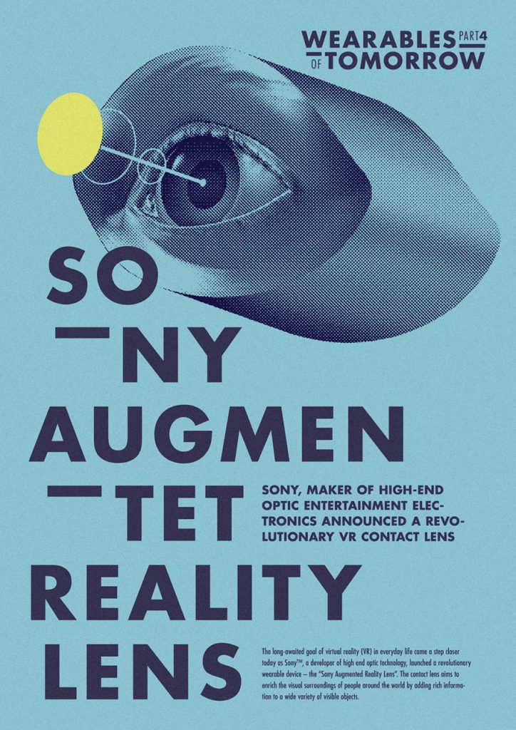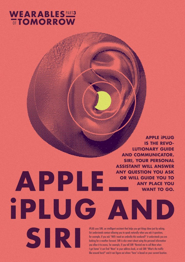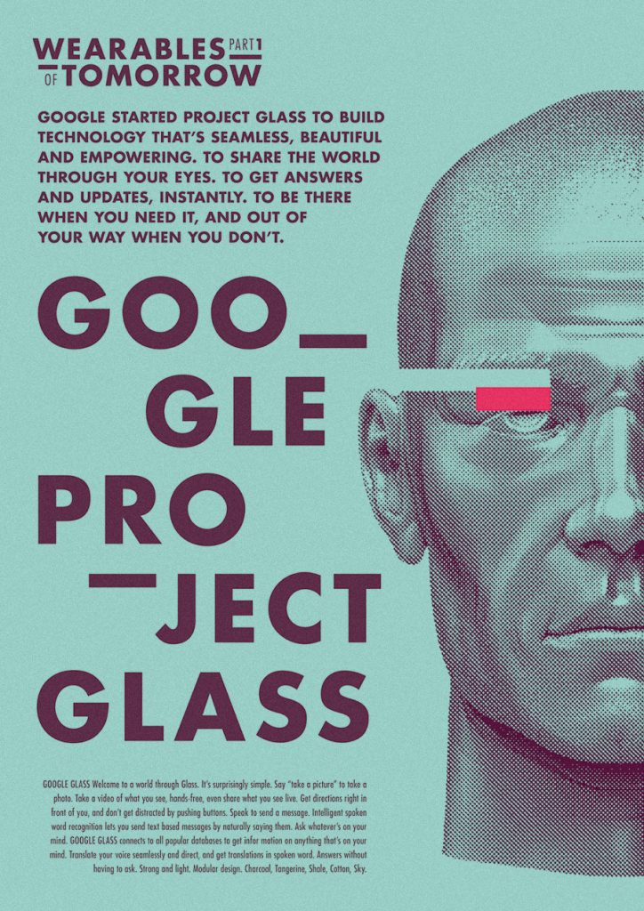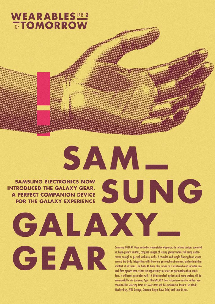

Graphic Design
Interpretation of the font family „Futura“
for the typography exhibition TYPE2.
Until recently, I hated the font but lately it seems like I’m falling in love with it. Futura was created in 1927 by Paul Renner and was very popular in the 50s and 60s. It was also used for advertising at that time, and I think it fitted to products that seemed futuristic. From our perspective, those products seem silly and the advertising naive. I wanted to port that flair and use it to advertise recent products. I’m sure that in 30-40 years from now, we will laugh at our stuff the same way we did with products of the 60s.